10 min read
Overview
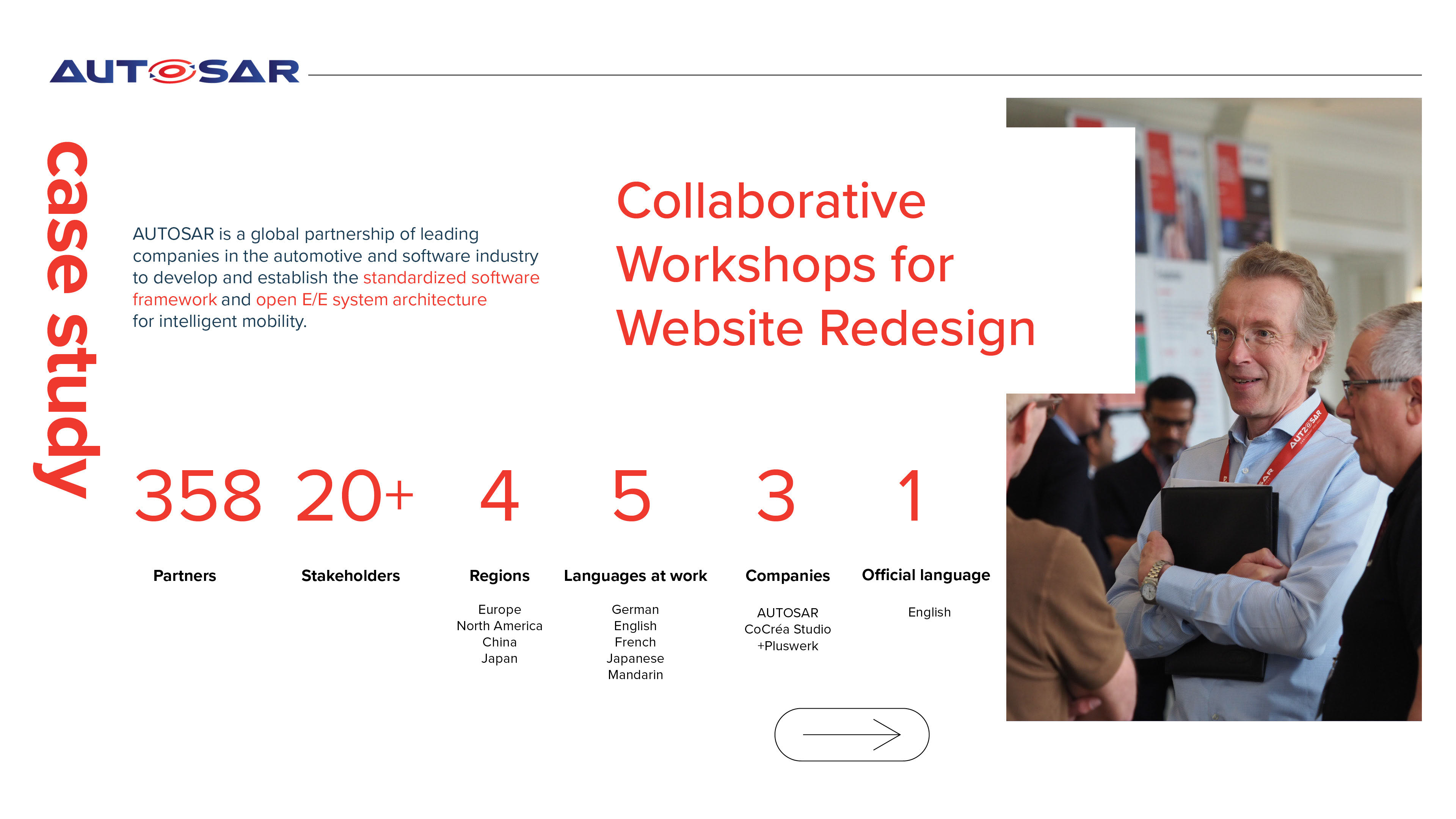
Autosar is a global partnership of 350+ leading companies in the automotive and intelligent mobility software industry.
The purpose of the project was to redesign their website to ensure alignment with user needs, business objectives and provide clear communication.
Team
UX/UI - CoCréa Studio (Montréal) / Development - Pluswerk AG (Munich)
My Role: I focused on research, UX strategy, UI prototyping, and co-facilitating workshops.
Lorena Garcia: UI design, art direction and workshop lead co-facilitator.
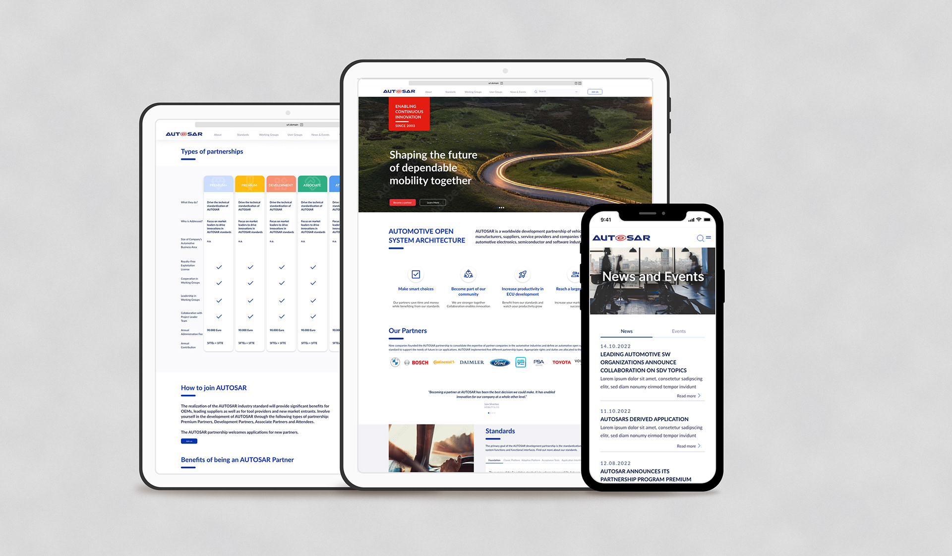
Autosar website 2024
Methodology
1. UX strategy & research
User interviews, competitor analysis, and collaborative workshops.
3. Brand
Branding, content strategy.
2. UI Design
Low, medium & high fidelity prototyping.
4. Development (Not within the scope of this project.)
We collaborated with Pluswerk AG, who took over the development phase after we delivered our research and final design.
Kickoff Workshops
Cross cultural workshops: 30+ hours with 20+ stakeholders from 4 continents.
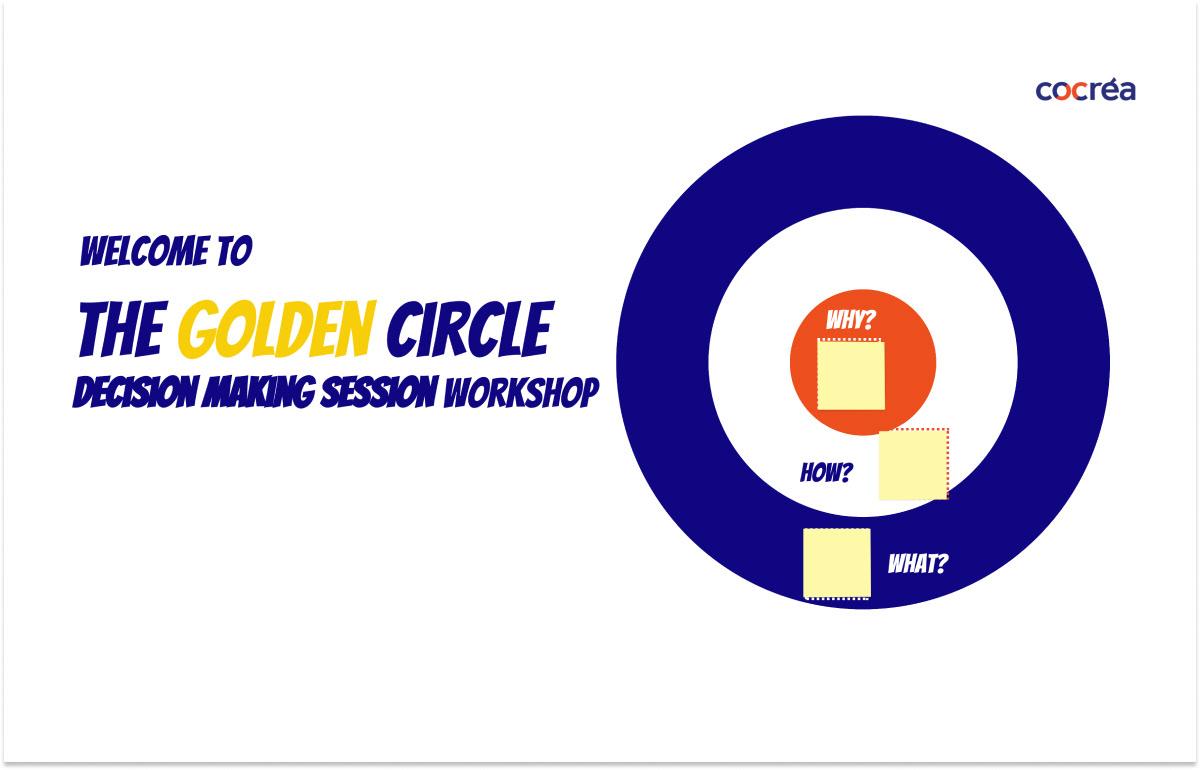
1. Golden Circle - What, how, why?
This workshop, based on Simon Sinek's Golden Circle, guided Autosar in revisiting and clarifying their core purpose ("Why"), aligning their values and processes ("How"), and refining their offerings ("What"). This approach fostered innovation, enabling stronger differentiation and more resilient decision-making within the organization.
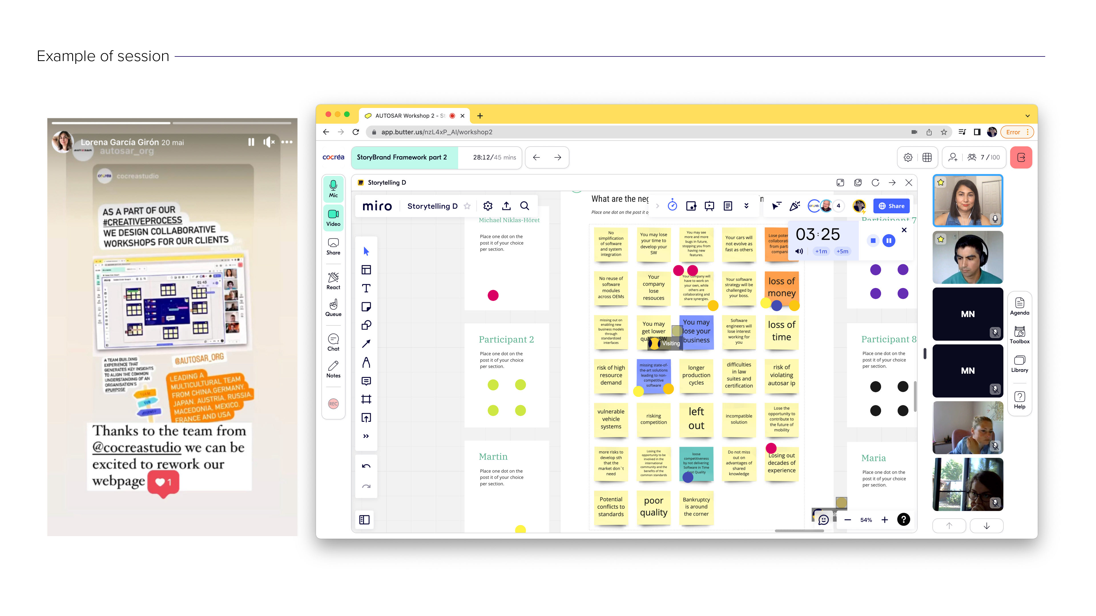
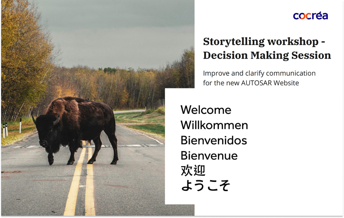
2. Storytelling - Hero partners, Autosar the guide.
Story is the most powerful tool available to compel the human brain. We used the power of storytelling as a tool to engage and resonate with the audience. By clarifying the organization's message and positioning the customer as the hero, we crafted compelling narratives that build trust, foster loyalty, and emotionally connect with the audience.
"The workshops gave us a profound understanding of the organization and helped us develop a clear and effective communication strategy."
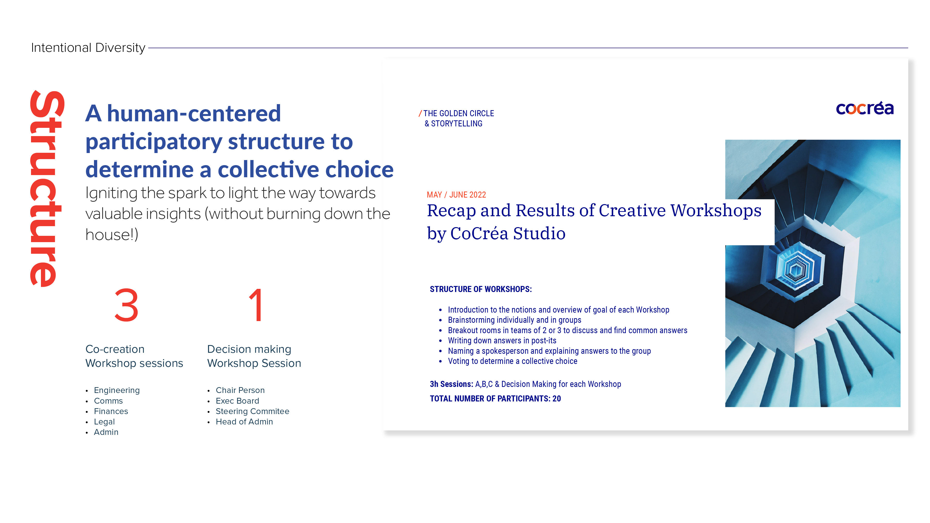
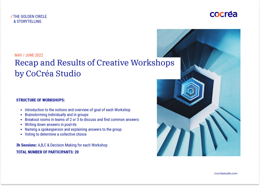
Structure of workshops
A human-centered participatory structure to determine a collective choice.
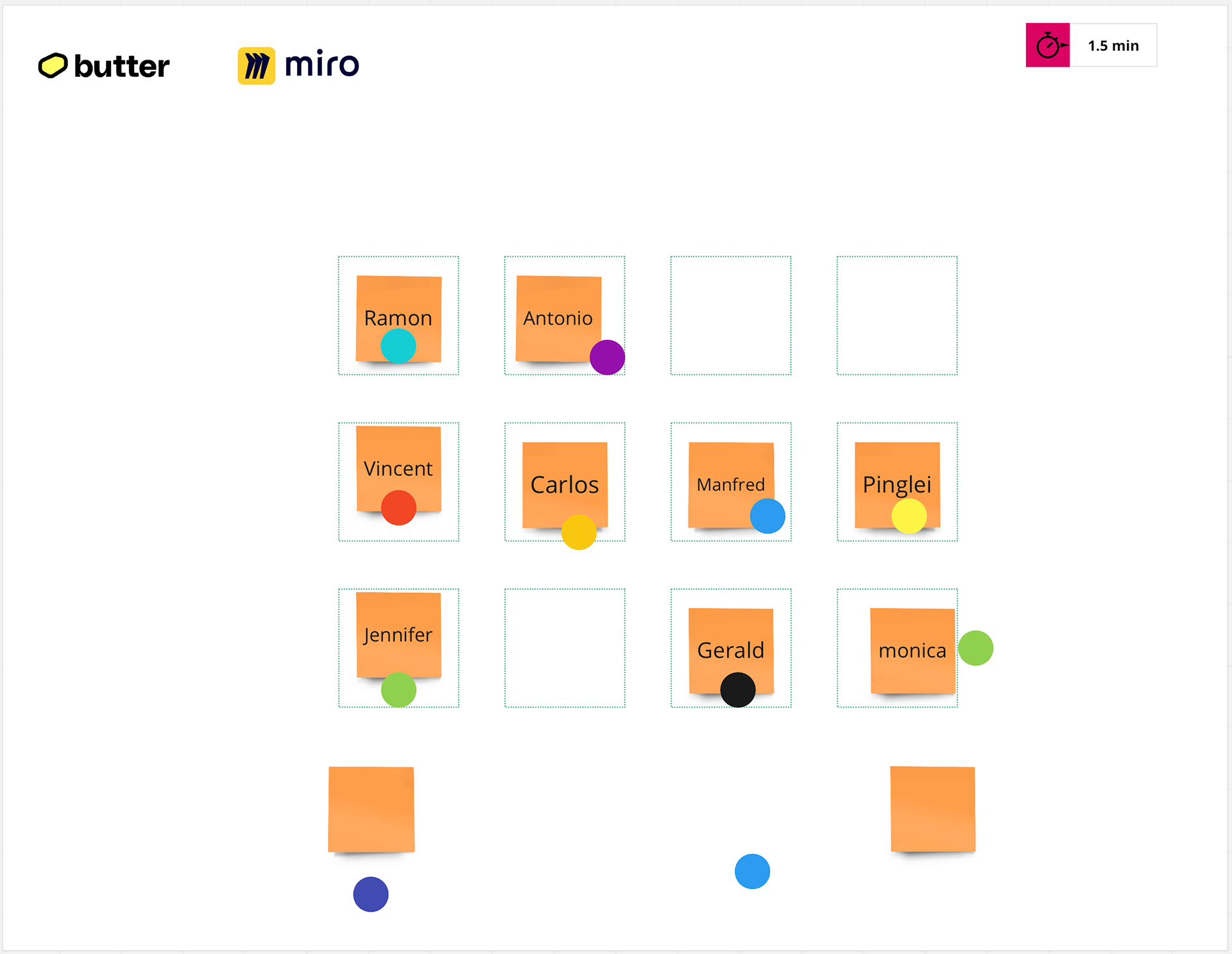
The workshops were conducted remotely with a total of 23 participants.
3-hour Sessions for Groups A, B, and C:
•Participants from North America, Europe, and Asia
• Included members from various departments: engineering, communication, finance, legal,
and admin.
3-hour Decision-Making Session for Group D:
•Reviewed and voted on results from previous sessions
• Participants included: Chairperson, Executive board, Steering committee, and Head of admin
SteP 1 workshops
Get everyone on board from the start to obtain support to move forward.
Creative collaboration fosters synergy among stakeholders and organization members, prioritizing collective input over individual contributions, ensuring every voice is heard and valued in decision-making.
An intentional and fun invitation for everyone to participate.
Our objective was to encourage broad participation, ensuring project momentum and cohesion while preventing disruptions from non-participants later on.
"We knew that ownership of the results is crucial for both the approval and successful implementation process."
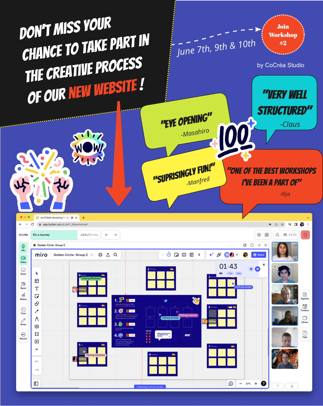
Autosar workshop invitation flyer, Cocréa Studio 2022
SteP 2 workshops
Creating a playful space: Stepping out of your comfort zone, into a safe space.
How? By including the following:
1. Intentional Diversity
Analyzing participants' characteristics and ensuring that groups and teams are complementary.
2. Elimination of Hierarchies
This allows for expressing oneself more freely on equal footing.
3. Authenticy
Being authentic requires courage and vulnerability when expressing our ideas in a group, which is essential in a co-creation process.
4. Creativity + Fun
Creativity thrives in a relaxed and playful environment. Play is our common language.
5. Humour
Humor is powerful; laughter blocks negative emotions, brings us together.
And, choosing the adequate platform to mix it all together.
We selected a collaborative platform that enabled us to use visuals, sound reactions, stickers, and more. By embracing vibrant colors and engaging imagery, we fostered a playful, inclusive environment where all ideas were welcomed. The experience was both fun and enjoyable for all participants!
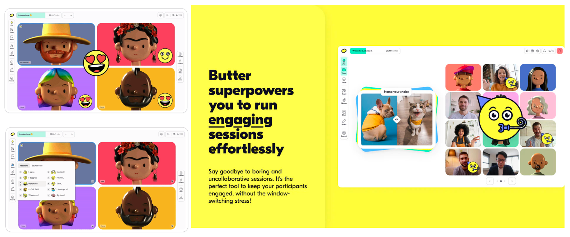
Butter collaborative platform
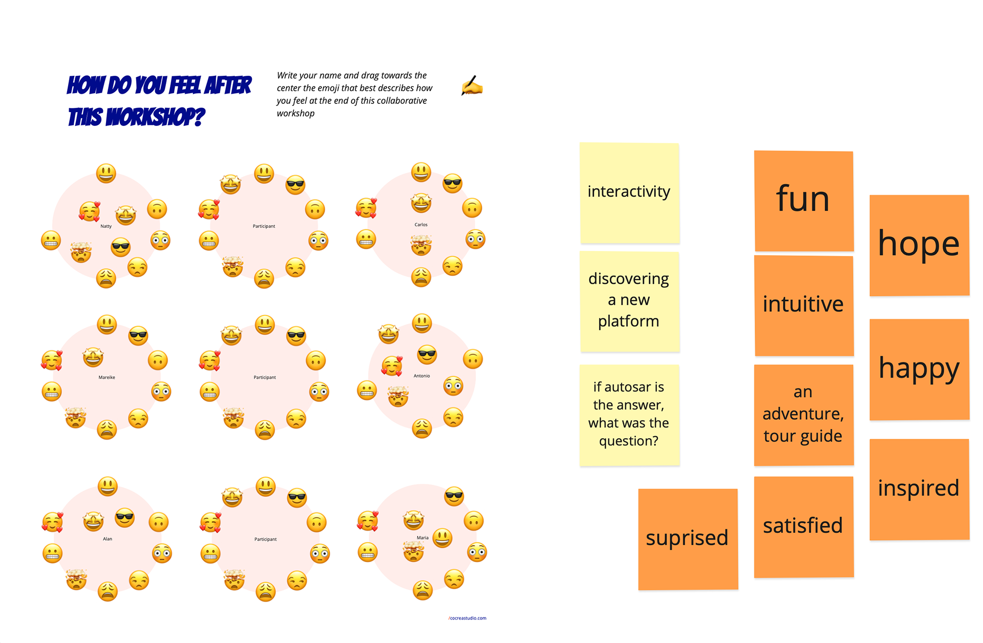
Feedback Golden Circle session A
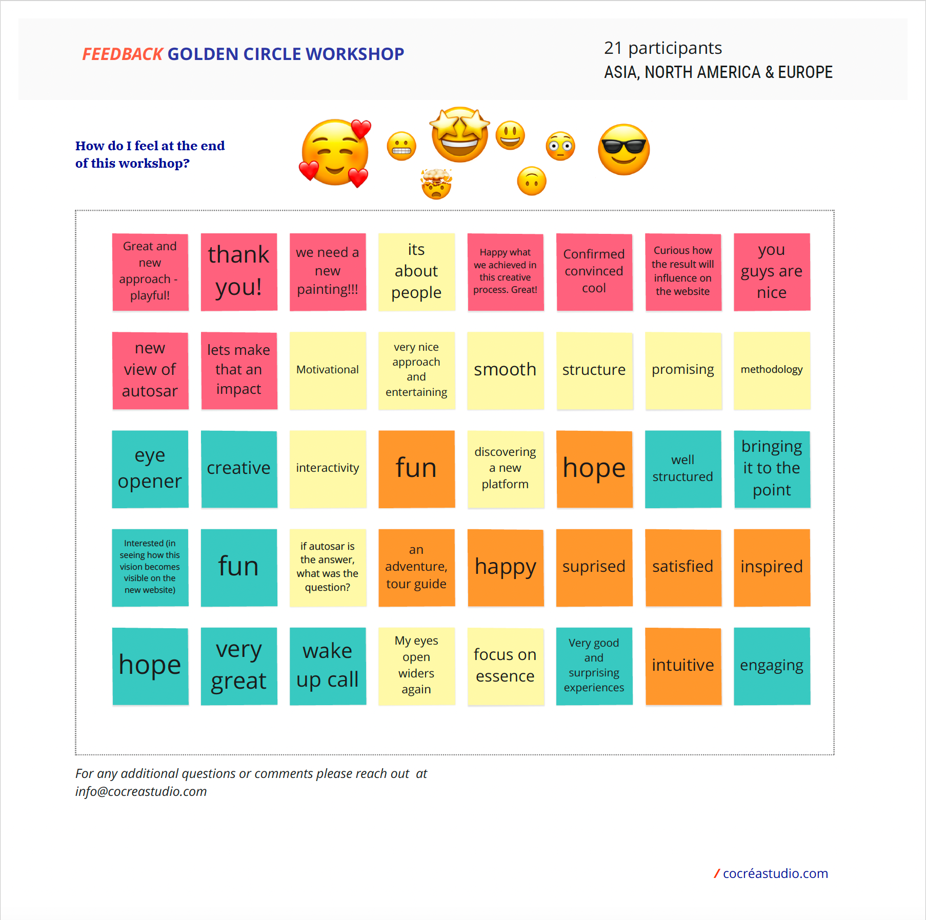
Final Feedback Golden Circle
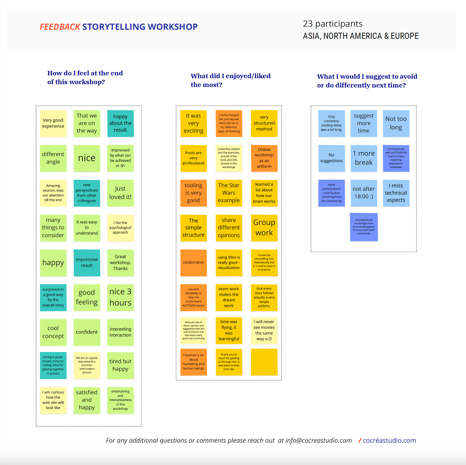
Final feedback Storytelling
SteP 3 workshops
Cross functional team alignment : Framing problems and setting the course for success.
1. Framing the problem
Participants anonymously shared their impressions of the website redesign problem, then voted to prioritize these responses.
Key priorities:
•The search engine lacks intuitiveness.
•The search function is ineffective.
• News and updates are not prominently displayed.
•The content is text-heavy.
• The site lacks a human touch.
From this feedback, it became clear that we needed to focus on improving the search engine and functionality, enhancing the news and events page, adding a human element, and refining the overall messaging.
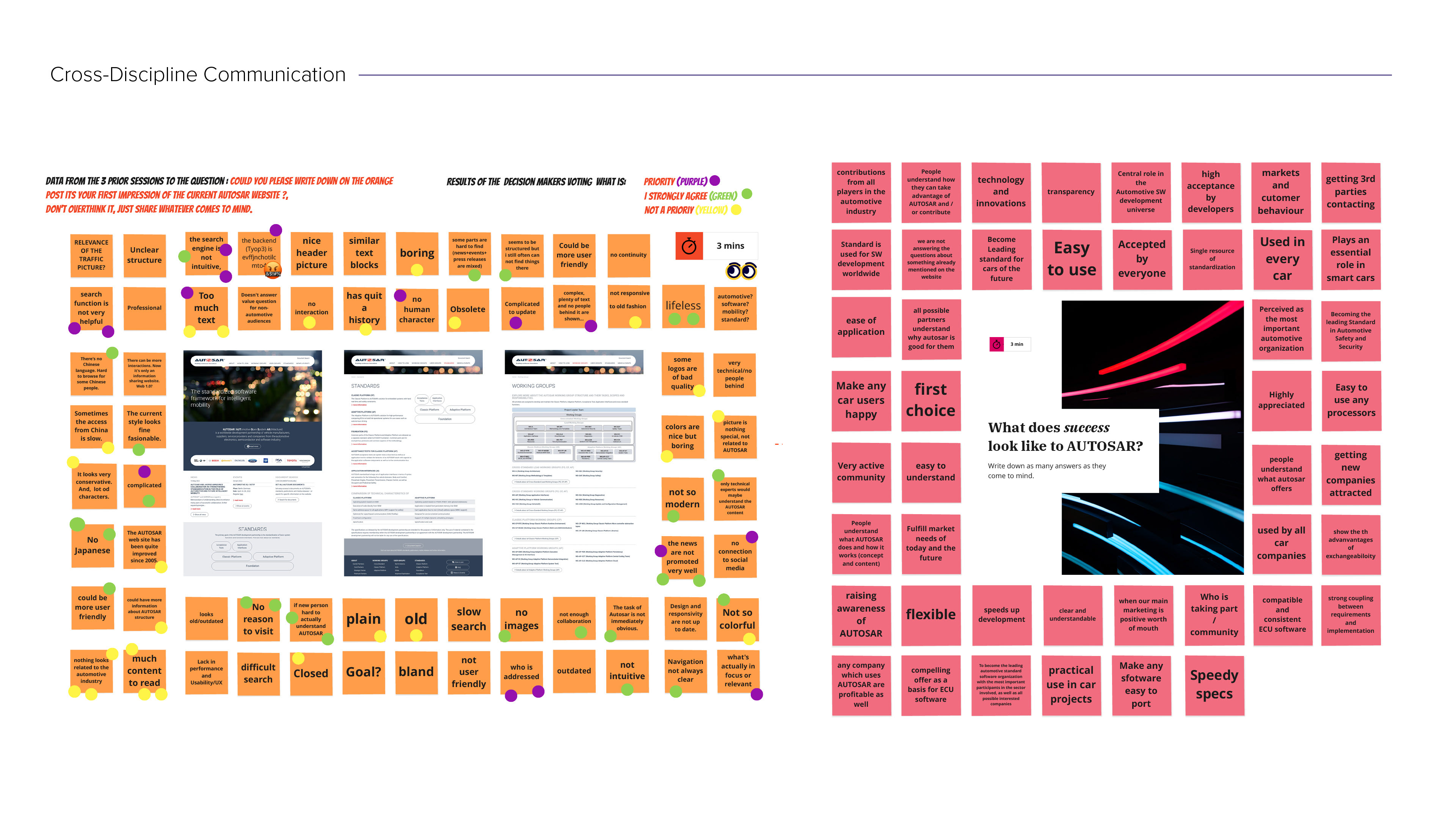
2. Set a course for success: what does success look like?
To ensure project success, we needed to align on goals, which can differ widely among team members. These insights helped us grasp the organization's broader objectives, moving beyond just a website redesign. Because a website is merely a means to achieve these goals.
Key insights:
•Ease of use and user experience
•Marketing and communication
•Transparency and understanding
•Community and collaboration
These results reinforce the importance of addressing previously identified pain points, such as improving usability, clarifying communication to attract new partners, and incorporating a human element into the concepts of collaboration and community.
SteP 4 workshops
Simplifying the complex: Speak so everyone understands.
Given the complexity of Autosar’s work and the diverse backgrounds of their organization and audience, we focused on ensuring clarity in communication, deliberately avoiding the curse of knowledge.
Keep it simple
We used the example of JFK when he campaigned for president, he didn't say, 'We want to build a better space program filled with the nation's best scientists and engineers to develop technology that will boost the economy, etc.' He simply said:
"We will put a man on the moon."
Rephrase so a 10-year-old can understand.
This did not mean the rest was excluded, but rather that anyone could easily understand its purpose and join their mission.
"We make cars speak the same language."
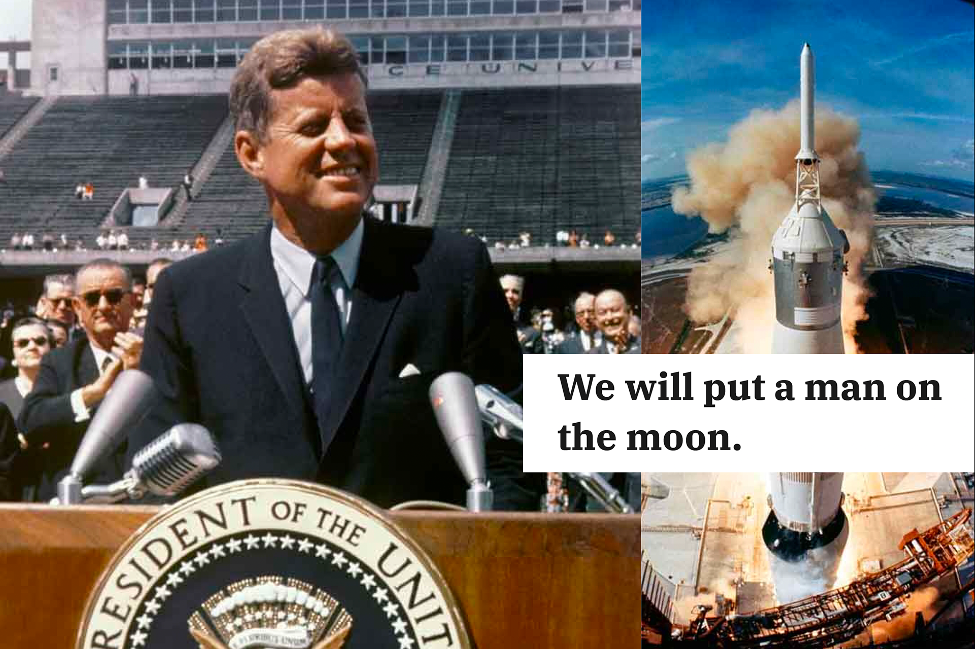
Photo: express.co.uk 2023
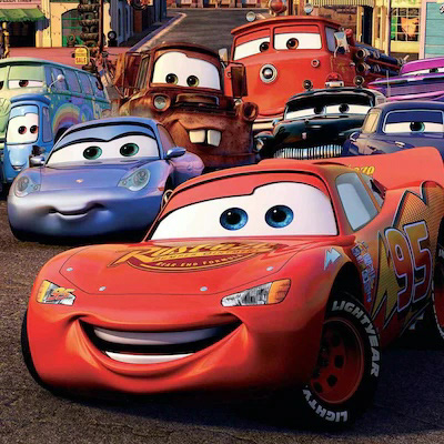
Cars, Disney -Pixar Animation Studios 2006
SteP 5 workshops
Technological inclusivity: from Baby Boomers to Gen Z.
Simplicity was key in designing our workshops to effectively communicate complex information across an intergenerational audience with varying levels of technological literacy.
From a heavy back-end
We streamlined the technical aspects to make participation effortless, ensuring we could gather valuable input from everyone despite time constraints.

To a very light front-end
Participants only needed to double-click, type, and drag visual elements to cast their votes.
SteP 6 workshops
No data loss: Documentation and accessibility to results.
Both Autosar and +Pluswerk were actively involved in the workshops. We meticulously documented all discussions and decisions, ensuring that the information remained accessible to all stakeholders, even after the project concluded.
"Every participant's input was captured, making the documentation a valuable resource for future projects."
•Workshop summary
•Workshop sessions A, B, C and Decision making.

UI Design
Translating research findings into actionable design proposals.
1. Low-fi & Hi-fi prototyping:
Low and medium fidelity prototypes were developed to validate ideas and gather feedback, allowing quick iterations. High fidelity prototypes of 6 screens were created to resemble the final product. These prototypes were essential for user testing and stakeholder approvals.
Low and medium fidelity prototypes were developed to validate ideas and gather feedback, allowing quick iterations. High fidelity prototypes of 6 screens were created to resemble the final product. These prototypes were essential for user testing and stakeholder approvals.
2. Design System:
A comprehensive design system was built at an atomic level in Adobe XD and handed over to the development team for implementation.
A comprehensive design system was built at an atomic level in Adobe XD and handed over to the development team for implementation.
LANDING PAGE
An inspiring and clear invitation to join Autosar.
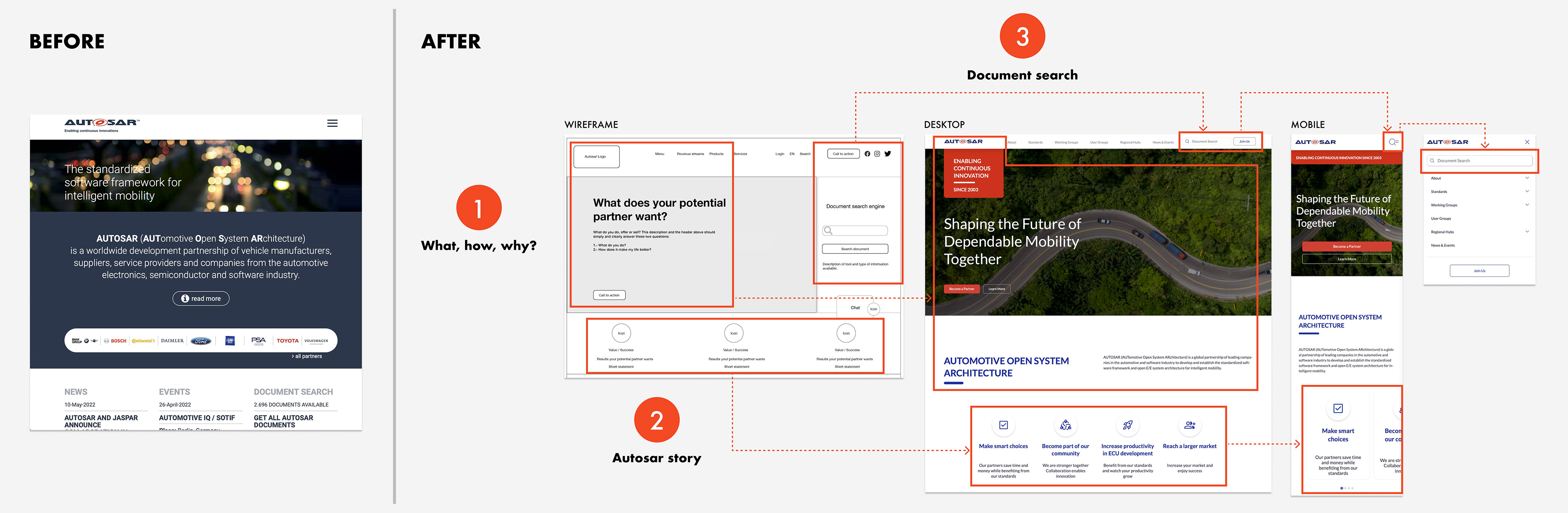
1. Why, how, what?
•Why: A shared, inspiring statement from the "Golden Circle" workshop that aligns all website content and functionality with the core mission.
•How: An accessible definition of AUTOSAR.
•What: AUTOSAR Does (Slogan)
3. Document search
Key updates were made to improve visibility and functionality, addressing user feedback on its lack of intuitiveness and effectiveness across desktop and mobile.
•Wireframe: Made more prominent due to its frequent use.
•Hi-fi prototype: Moved to the top navigation for familiarity and labeled "Document Search" to clarify its purpose. On mobile, a combined icon with the menu was introduced to save space and ensure relevance for users.
2. Autosar Story
AUTOSAR’s story serves as a guide to highlight the benefits of becoming a partner, developed through storytelling in workshop #2.
Icons were added for clarity, and on mobile, cards were implemented for better usability.
LANDING PAGE 2
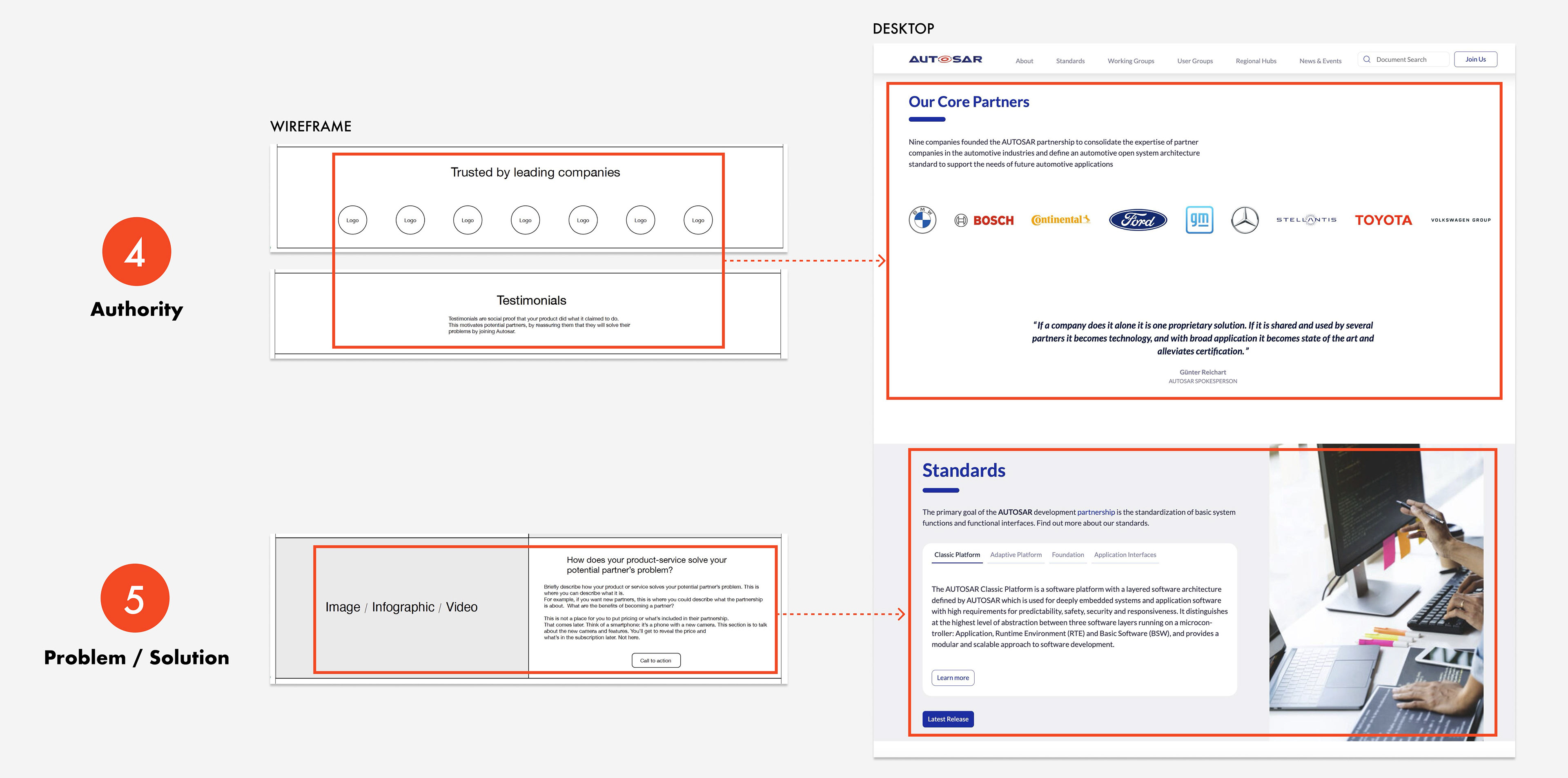
4. Authority
Testimonials and core partners help reinforce the credibility and establish AUTOSAR as the right solution for their potential partners' challenges.
5. Problem / Solution
Tabs were used here to organize content in a clean and efficient way, allowing users to switch between different platforms (Classic, Adaptive, Foundation, etc.) without overwhelming them with information. This improves usability by reducing cognitive load and helps users find relevant content quickly within the same section.
The image was added to humanize the page, addressing workshop feedback about the need for more relatable, human elements.
LANDING PAGE 3
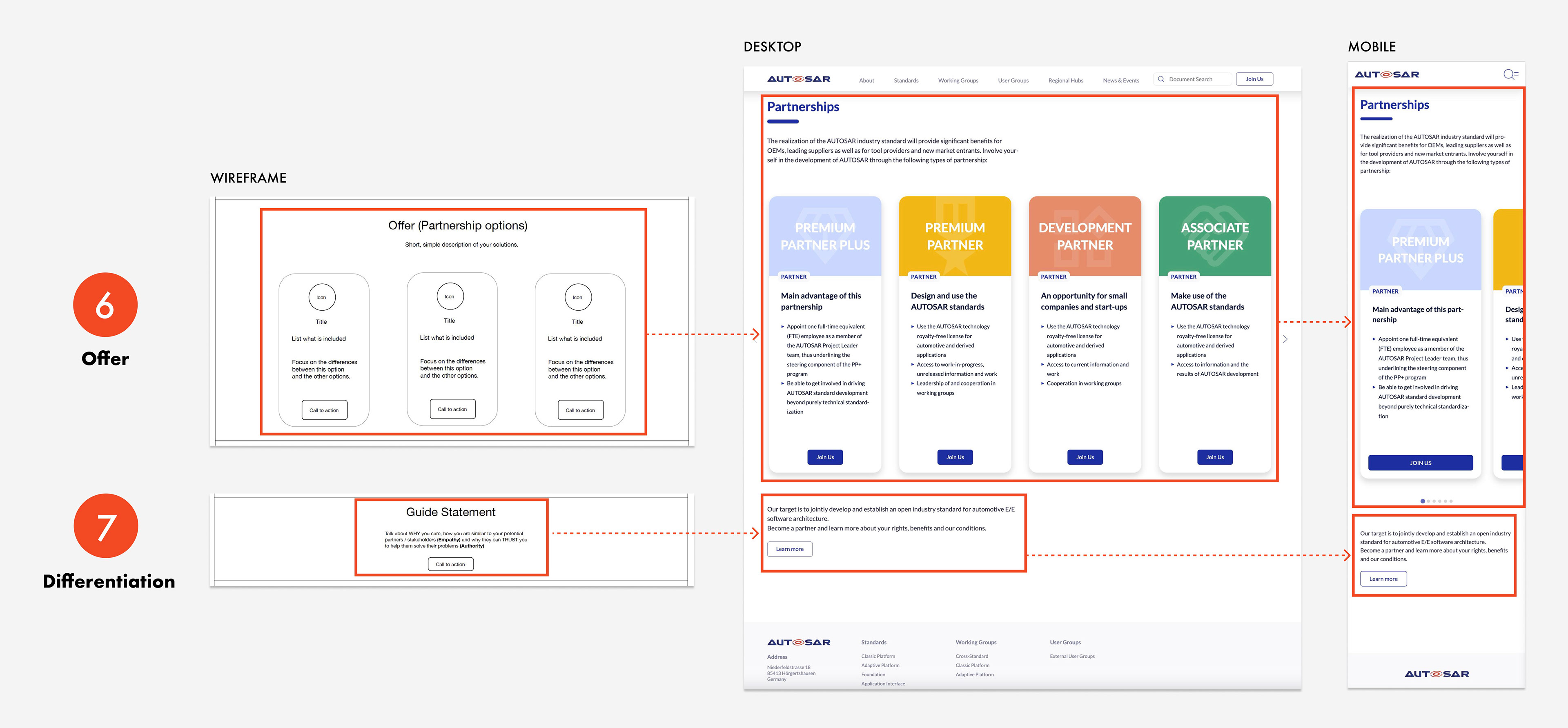
6. Offer
Partnership cards were redesigned for better usability, visual clarity, and engagement. Key improvements included:
•Clear Visual Hierarchy: Color coding, icons, and graphics enhance differentiation between partnership options.
•Enhanced Content & CTAs: Detailed descriptions with engaging language and prominent "Join Us" buttons boost user interaction.
•Streamlined User Experience: A refined layout guides users to quickly compare partnership options and take action.
7. Differentiation
The differentiation section evolved from a placeholder to a more engaging and clear description, highlighting key benefits with a "Learn more" CTA.
•Hi-fi prototype: Refined messaging, clearly stating the target and benefits, with a CTA for better engagement.
•Visual improvements: Clean layout to enhance authority and guide user attention effectively.
News AND EVENTS PAGE
Streamlined access to Autosar’s news and events.
With Autosar’s active presence at global conferences and regular news announcements, the improved interface ensures that partners and stakeholders can stay informed efficiently.
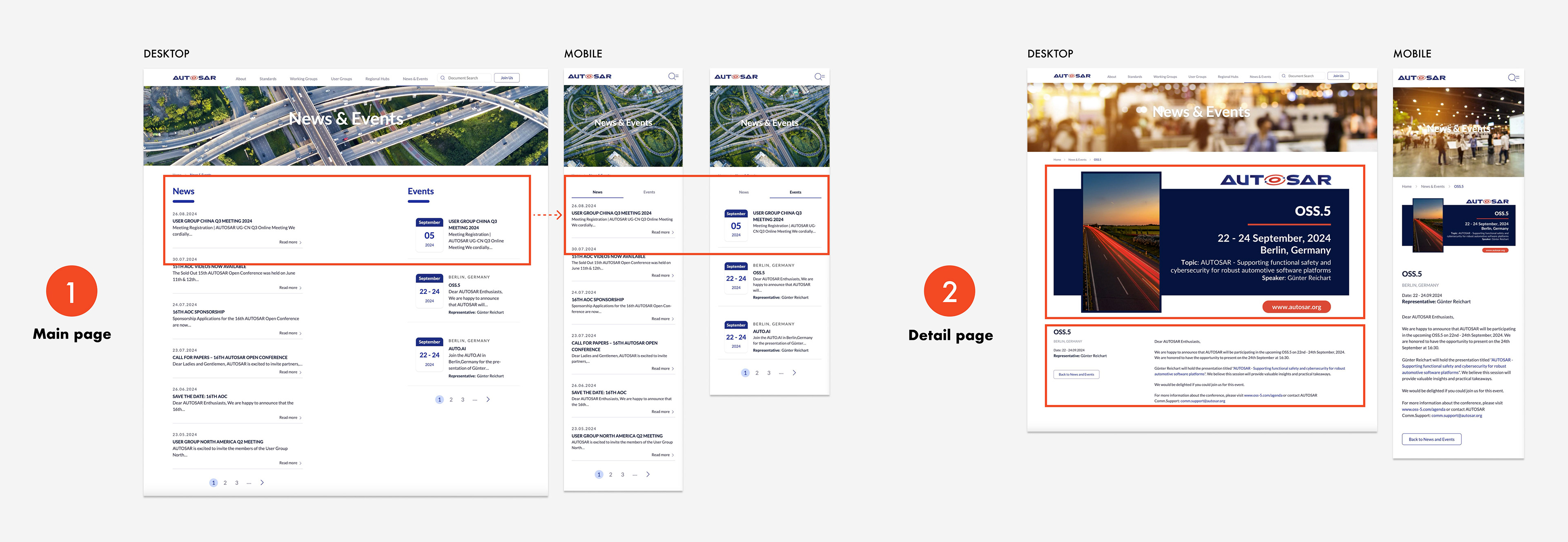
1. Main page
•Integrated info: Combines events and news in one streamlined section.
•Easy Navigation: Clickable cards, "Read More", "All Events" and “All News” CTAs for deeper exploration.
•Mobile: Tabs were added to optimize usability by organizing content more effectively, allowing users to quickly switch between news and events, while maximizing space on smaller screens.
2. Detail page
Added a customizable image space that acts as an invitation, featuring curated visuals from a selected image library, following brand guidelines.
The communication team can update this section for each event, ensuring visual consistency and relevance.
Below the image, all relevant event details are provided along with a clear call to action for further engagement.
PARTNERSHIPS PAGE
Clarifying partnership acquisition process.
•Before: The partnership management team handled numerous inquiries for clarification.
•After: Clients now access key information independently, reducing the need for support and enabling the team to focus on securing partnerships.
Results: From 2022 to 2023, 17 new partners were acquired, generating over 460K CAD in additional revenue. This includes two Premium Plus partners, each contributing 132K CAD annually. (Autosar, 2024).
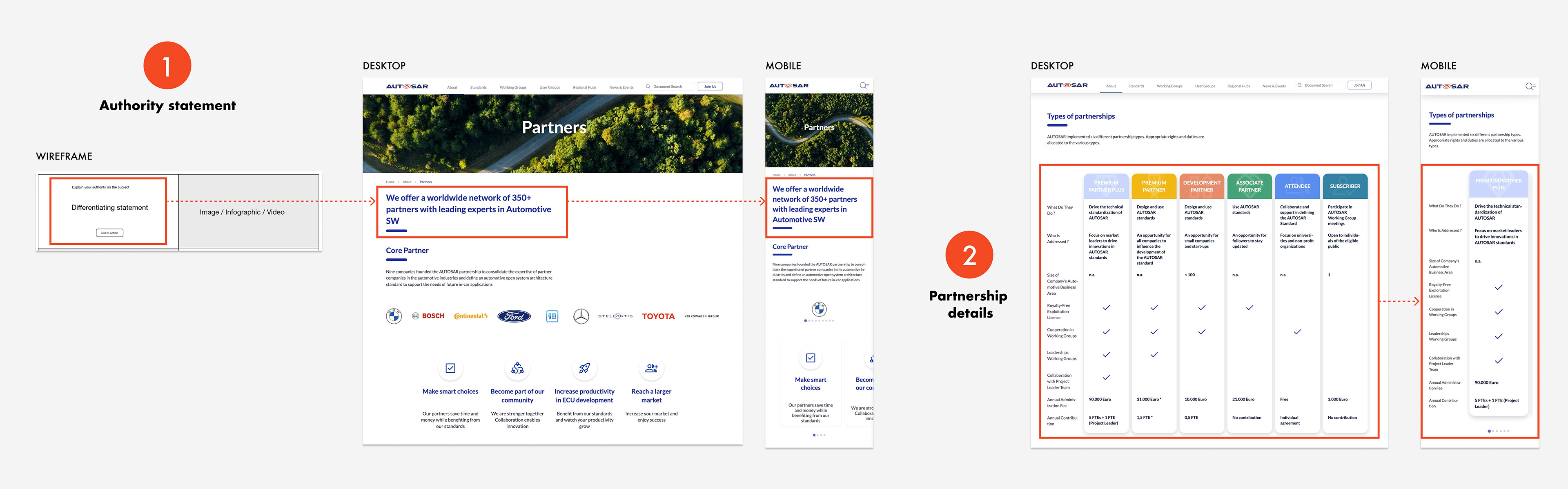
1. Authority statement
•This statement establishes credibility and differentiates Autosar, enhancing confidence in potential collaborations. Refined during Workshop #2: Storytelling.
2. Partnership details
•Partnership levels: Six types tailored to different company needs and engagement.
•Benefits overview: Clear breakdown of rights, duties, and fees.
•Accessible design: Optimized cards for both desktop and mobile.
PARTNERSHIPS PAGE 2
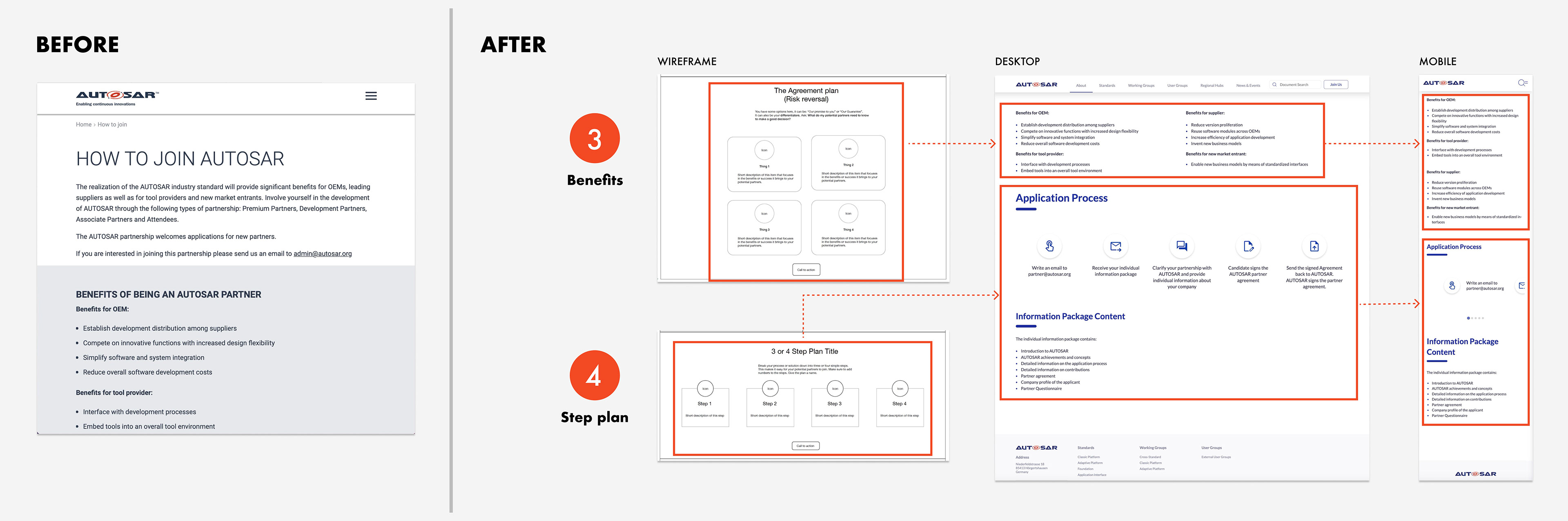
3. Benefits
•Targeted advantages: Clearly highlights benefits for OEMs, suppliers, and tool providers.
•Optimized presentation: Information is structured to be easily accessible on both desktop and mobile.
4. Step plan
•Clear process: A simple 5 step process that guides users through the partnership application.
•User-friendly layout: Icons and brief descriptions make each step easy to understand.
SEARCH PAGE
Improving internal search for efficient information access.
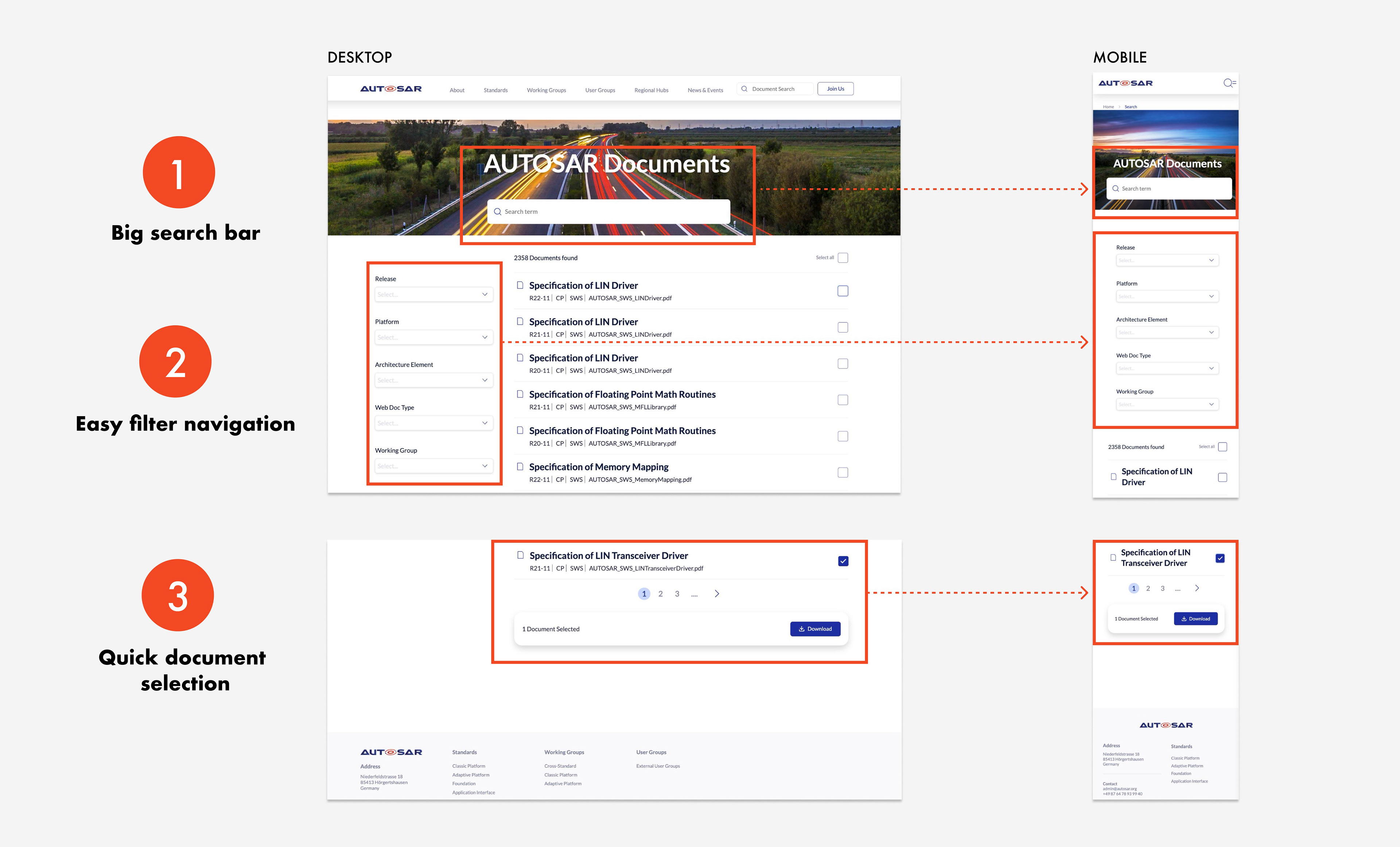
1. Big search bar
•Ensures the search function is highly visible, familiar and easy to access.
•Supports accessibility by providing a clear, prominent entry point for users.
•The image emphasizes speed and precision.
3. Quick document selection
•Highlights selected documents for easy confirmation.
•The floating download button streamlines the process without additional steps.
2. Easy filter navigation
•Filters are stacked vertically for quick scanning and usability.
•Labels simplify the process of refining search results quickly and accurately.
Outcome and Results
Developer handoff and deliverables
The project concluded with the successful launch of the AUTOSAR website in 2022. We collaborated with the german agency +Pluswerk to finalize the development. Despite some adjustments due to technical challenges, the outcome successfully met key objectives.
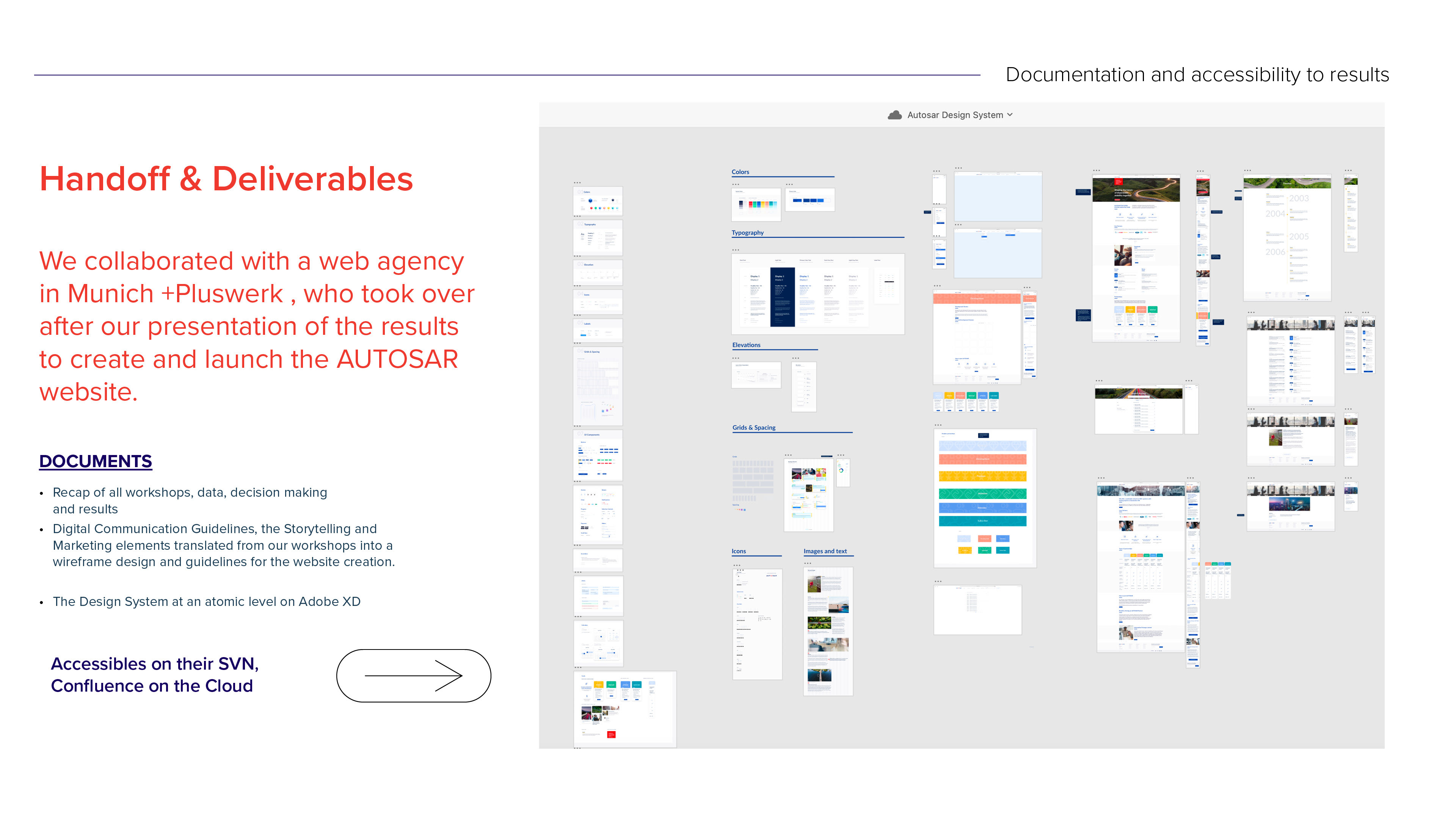
Deliverables included:
•Research & Strategy: Workshop summaries, communication strategy, and storytelling guidelines.
•Design: High-fidelity prototypes and a comprehensive Design System.
Accessibility: All resources, including a 40-page documentation set, were made accessible via SVN, Confluence, and cloud platforms.
To learn more, visit: www.autosar.org
Lessons LEarned
Takeaways from collaboration, empathy, and adapting to challenges across continents.
1. I became an articulated communicator
With over 100 hours dedicated to meetings and exchanges, I refined my interpersonal and multicultural communication abilities. Collaborating across remote teams spanning four continents, I effectively engaged with stakeholders ranging from executives and managers to engineers, developers, product owners, project managers, and creative professionals.
3. I learned to empathize with stakeholders
I realized how important it is to empathize with stakeholders by regularly seeing things from their viewpoint and understanding their struggles. This shift encouraged me to move from a defensive position to one of solidarity.
2. I improved my workshop design and facilitation skills
I refined my workshop design skills, tailoring frameworks to meet client needs and delivering them on collaborative platforms. Additionally, I strengthened my remote facilitation abilities while covering the technical demands.
4. The extra mile pays off: Navigating time zones
By adjusting to time zone differences and working from 2 am to 6 am (EST), we successfully coordinated workshops across 4 continents. This effort enabled the involvement of key stakeholders and improved data collection, resulting in more representative organizational insights.